Pantone Colors of the Year 2016: Rose Quartz & Serenity
Have you heard? Pantone just released the 2016 Colors of the Year. And yes, you read that correctly.
Calm, tranquil, soft; these are words we're seeing more often as of late. The world is filled with so much noise, a brash loudness and constant chatter from news feeds and social media. Is it any wonder that when it comes to the physical things that we interact with on a daily basis, we want and need a sense of peace?
Colors.
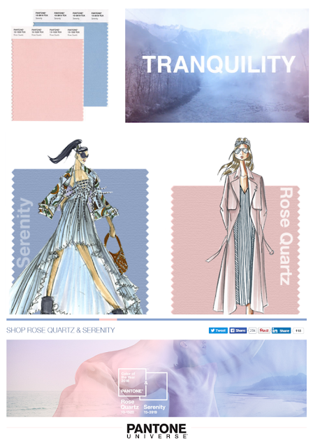
For the first time since the color-matching company began publicly crowning one lucky color as thee color for everything from fashion to home decor accents... Pantone has picked two colors that will stand side by side, ruling 2016 from atop their matching thrones.
Can you tell that I just finished NaNoWriMo?
But I digress.
Presenting Rose Quartz and Serenity...
 |
| all images c/o Pantone Color Institute |
Both shades were featured in Pantone's Spring 2016 Forecast, a trend we've previously seen with Marsala and Radiant Orchid. The Spring Forecast came out back in September of this year, just in time for Fashion Week. At the time, this is what Leatrice Eiseman, Executive Producer of Pantone Color Institute had to say about the Colors of the Year:
"The soothing, calming nature of colors in the Spring collections are led by PANTONE 13-1520 Rose Quartz, a persuasive yet gentle tone that conveys compassion and a sense of composure. Like a serene sunset, flushed cheek, or budding flower, Rose Quartz reminds us to reflect on our surroundings during the busy but lighthearted spring and summer months."
"Weightless and airy, like the expanse of the blue sky above us, PANTONE 15-3919 Serenity comforts with a calming effect, bringing a feeling of respite even in turbulent times. A transcendent blue, Serenity provides us with a naturally connected sense of space."
Calm, tranquil, soft; these are words we're seeing more often as of late. The world is filled with so much noise, a brash loudness and constant chatter from news feeds and social media. Is it any wonder that when it comes to the physical things that we interact with on a daily basis, we want and need a sense of peace?
Because these two colors were part of the Spring 2016 Color Forecast by Pantone, both Serenity and Rose Quartz have started popping up in several designer collections. Don't worry if you can't find anything rightthisveryminute, because before long, we'll be at fever pitch. But it's not too late to include these two shades on your Christmas wishlist!
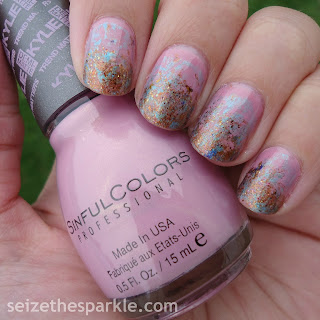
I know I'm already working on lists of Rose Quartz and Serenity polishes. So stay tuned for that, I usually try to sneak in a Color of the Year manicure to my 12 Manicures of Christmas series. But for right now, off the top of my head, here's a short list of contenders...
Rose Quartz: Milani Pink Beige, New York Color Upper West Side, Zoya Avril
Serenity: Essie Lapis of Luxury, SinfulColors Violets are Blue, Wet n Wild Skipping Stones
Happy Hunting!
 |
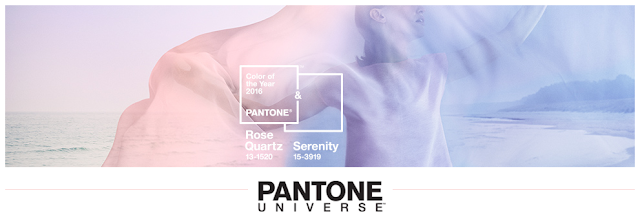
| c/o Pantone Color Institute |


Comments
Post a Comment